Trong swiftUI, bạn hoàn toàn có thể tự tuỳ chỉnh Toggle để phù hợp với giao diện người dùng.
Ở bài viết này, mình sẽ hướng dẫn cách tuỳ chỉnh một Toggle view. Bạn có thể dễ dàng đưa các styles của riêng mình cho các Toggle SwiftUI bằng cách sử dụng giao thức ToggleStyle. Đơn giản chỉ cần thay đổi thuộc tính isOn bên trong instance Configuration được đưa từ hàm makeBody(configuration: ).
Tạo một Custom ToggleStyle
Để bắt đầu, mình tạo một struct MyToggleStyle và cho nó thực thi protocol ToggleStyle. Sau đó, thực thi hàm makeBody(configuration: ). Đây là nơi bạn sẽ tạo custom view của mình để hiển thị thay cho switch mặc định.
import SwiftUI

struct MyToggleStyle: ToggleStyle {

    func makeBody(configuration: Configuration) -> some View {
    	// Code custom toggle
    }

}
Áp dụng custom ToggleStyle cho Toggle của bạn như sau:
Toggle(isOn: $active, label: {
	Text("Active")
})
.toggleStyle(MyToggleStyle())
Một số ví dụ
Dưới đây là một vài ví dụ mà mình sẽ thực hiện mẫu. Bạn hoàn toàn có thể tự tuỳ chỉnh một hoặc nhiều styles riêng cho Toggle của bạn để phù hợp với yêu cầu dự án.
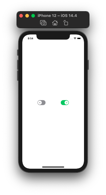
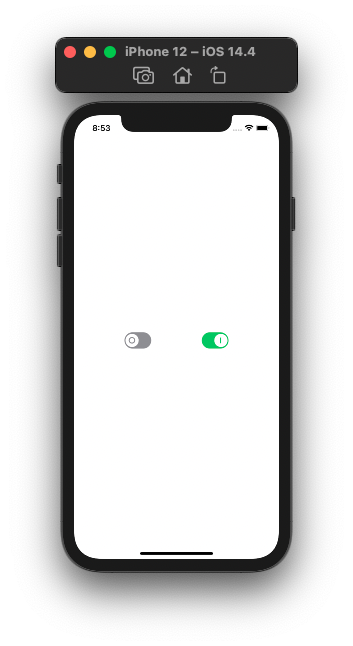
CheckmarkToggleStyle
import SwiftUI

struct CheckmarkToggleStyle: ToggleStyle {

    func makeBody(configuration: Configuration) -> some View {
        HStack {
            configuration.label
            Rectangle()
                .foregroundColor(configuration.isOn ? .green : .gray)
                .frame(width: 51, height: 31, alignment: .center)
                .overlay(
                    Circle()
                        .foregroundColor(.white)
                        .padding(.all, 3)
                        .overlay(
                            Image(systemName: configuration.isOn ? "checkmark" : "xmark")
                                .resizable()
                                .aspectRatio(contentMode: .fit)
                                .font(Font.title.weight(.black))
                                .frame(width: 8, height: 8, alignment: .center)
                                .foregroundColor(configuration.isOn ? .green : .gray)
                        )
                        .offset(x: configuration.isOn ? 11 : -11, y: 0)
                        .animation(Animation.linear(duration: 0.1))

                ).cornerRadius(20)
                .onTapGesture { configuration.isOn.toggle() }
        }
    }

}
PowerToggleStyle
import SwiftUI

struct PowerToggleStyle: ToggleStyle {

    func makeBody(configuration: Configuration) -> some View {
        HStack {
            configuration.label
            Spacer()
            Rectangle()
                .foregroundColor(configuration.isOn ? .green : .gray)
                .frame(width: 51, height: 31, alignment: .center)
                .overlay(
                    Circle()
                        .foregroundColor(.white)
                        .padding(.all, 3)
                        .overlay(
                            GeometryReader { geo in
                                Path { p in
                                    if !configuration.isOn {
                                        p.addRoundedRect(in: CGRect(x: 20, y: 10, width: 10.5, height: 10.5), cornerSize: CGSize(width: 7.5, height: 7.5), style: .circular, transform: .identity)
                                    } else {
                                        p.move(to: CGPoint(x: 51/2, y: 10))
                                        p.addLine(to: CGPoint(x: 51/2, y: 31-10))
                                    }
                                }.stroke(configuration.isOn ? Color.green : Color.gray, lineWidth: 2)
                            }
                        )
                        .offset(x: configuration.isOn ? 11 : -11, y: 0)
                        .animation(Animation.linear(duration: 0.1))

                ).cornerRadius(20)
                .onTapGesture { configuration.isOn.toggle() }
        }
    }
}
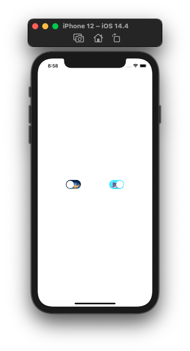
ImageToggleStyle
import SwiftUI

struct ImageToggleStyle: ToggleStyle {

    var onImageName: String
    var offImageName: String

    func makeBody(configuration: Configuration) -> some View {
        HStack {
            configuration.label
            Spacer()
            Image(configuration.isOn ? onImageName : offImageName)
                .resizable()
                .aspectRatio(contentMode: .fill)
                .frame(width: 51, height: 31, alignment: .center)
                .overlay(
                    Circle()
                        .foregroundColor(.white)
                        .padding(.all, 3)
                        .offset(x: configuration.isOn ? 11 : -11, y: 0)
                        .animation(Animation.linear(duration: 0.1))
                ).cornerRadius(20)
                .onTapGesture { configuration.isOn.toggle() }
        }
    }
}
Cảm ơn các bạn đã đọc!!!