In this article, we will see how to add bootstrap 5 modal popup in laravel 9. We will learn how to use the bootstrap 5 modal popup open using the on button click in laravel 9. Bootstrap 5 modals are built with HTML, jQuery, and CSS. Bootstrap supports one modal window at a time. For the bootstrap 5 modal popup, we will add the latest javascript CDN and bootstrap 5 CDN file. Also, you can close the modal using the data-bs-dismiss attribute. and bootstrap 5 modal popups use the fixed position.
Also, you can add animation to the modals. Change the size of the modal to small, large, and extra large using the bootstrap 5 classes.
So, let's see laravel 9 add bootstrap 5 modal popup, jquery bootstrap 5 modal popup, and how to use bootstrap 5 modal popup in laravel 9.
First, we will add bootstrap 5 CSS and Javascript files in the <head> tag.
<link href="https://cdn.jsdelivr.net/npm/[email protected]/dist/css/bootstrap.min.css" rel="stylesheet">
<script src="https://cdn.jsdelivr.net/npm/[email protected]/dist/js/bootstrap.bundle.min.js"></script>
Example:
<!DOCTYPE html>
<html lang="en">
<head>
<title>How To Add Bootstrap 5 Modal Popup In Laravel 9 - Websolutionstuff</title>
<meta charset="utf-8">
<meta name="viewport" content="width=device-width, initial-scale=1">
<link href="https://cdn.jsdelivr.net/npm/[email protected]/dist/css/bootstrap.min.css" rel="stylesheet">
<script src="https://cdn.jsdelivr.net/npm/[email protected]/dist/js/bootstrap.bundle.min.js"></script>
</head>
<body>
<div class="container mt-3">
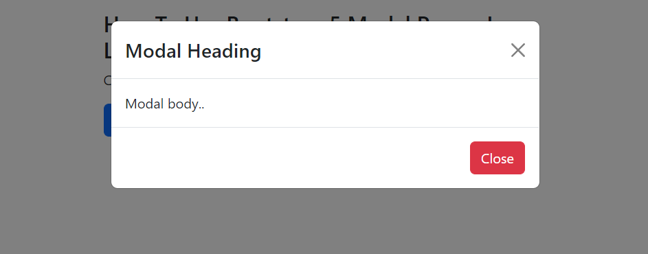
<h3>How To Use Bootstrap 5 Modal Popup In Laravel 9 Example - Websolutionstuff</h3>
<p>Click on the button to open the modal.</p>
<button type="button" class="btn btn-primary" data-bs-toggle="modal" data-bs-target="#myModal">
Open modal
</button>
</div>
<!-- The Modal -->
<div class="modal" id="myModal">
<div class="modal-dialog">
<div class="modal-content">
<!-- Modal Header -->
<div class="modal-header">
<h4 class="modal-title">Modal Heading</h4>
<button type="button" class="btn-close" data-bs-dismiss="modal"></button>
</div>
<!-- Modal body -->
<div class="modal-body">
Modal body..
</div>
<!-- Modal footer -->
<div class="modal-footer">
<button type="button" class="btn btn-danger" data-bs-dismiss="modal">Close</button>
</div>
</div>
</div>
</div>
</body>
</html>Output:
Using the .fade class to add a fade effect on the modal when it close and opens. For fade effect, add fade class with modal class.
<!-- Fading modal -->
<div class="modal fade"></div>

<!-- Modal without animation -->
<div class="modal"></div> Change the different sizes of modals using the bootstrap 5 classes. Add the size class to the <div> element with class .modal-dialog.
| Size | Class | Modal max-width |
|---|---|---|
| Small | .modal-sm |
300px |
| Default | None | 500px |
| Large | .modal-lg |
800px |
| Extra large | .modal-xl |
1140px |
// Small Modal
<div class="modal-dialog modal-sm">

// Large Modal
<div class="modal-dialog modal-lg">

// Extra Large Modal
<div class="modal-dialog modal-xl"> Display a modal popup with fullscreen using the bootstrap 5 modal-fullscreen class. And classes are placed on a .modal-dialog.
// Fullscreen Modal
<div class="modal-dialog modal-fullscreen">| Class | Availability |
|---|---|
.modal-fullscreen |
Always |
.modal-fullscreen-sm-down |
Below 576px |
.modal-fullscreen-md-down |
Below 768px |
.modal-fullscreen-lg-down |
Below 992px |
.modal-fullscreen-xl-down |
Below 1200px |
.modal-fullscreen-xxl-down |
Below 1400px |
You might also like:
- Read Also: Autocomplete Search using Bootstrap Typeahead JS
- Read Also: Bootstrap Session Timeout Example In Laravel
- Read Also: Bootstrap DateTimePicker Example
- Read Also: Bootstrap Modal In Angular 13