In this article, we will see Queen Elizabeth II portrait using CSS. Elizabeth II was Queen of the United Kingdom from 6 February 1952 until her death on 8 September 2022. Her reign of 70 years and 214 days was the longest of any British monarch and the second-longest recorded of any monarch of a sovereign country.
Also, see some facts about Queen Elizabeth II.
- Queen Elizabeth II favorite dogs were corgis
- Queen Elizabeth II was crowned Queen on 2 June 1953
- she was served by 15 UK Prime Ministers
- Queen Elizabeth II was the only person in the UK allowed to drive without a license
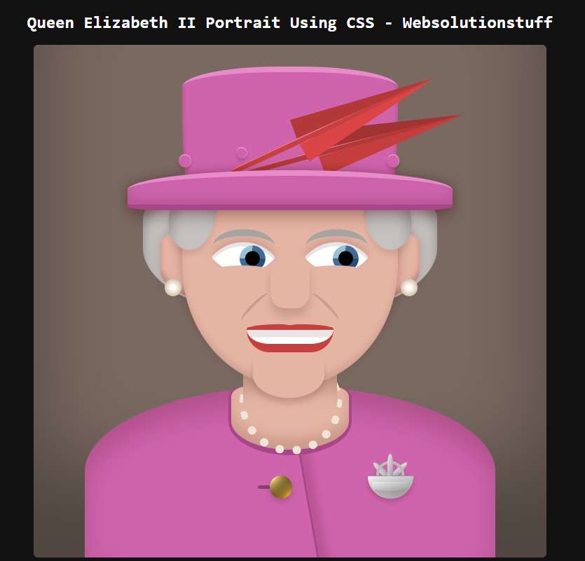
So, let's see something interesting like the Elizabeth II photo, portrait of Elizabeth II using CSS.
Add HTML
In this step, we will create an HTML code and add the following code.
<queen-liz id="queen">

  <queen-head>
    <div class="hair"></div>
    <div class="earrings"></div>

    <ul class="hat">
      <li class="top"><i></i></li>
      <li class="feather"></li>
      <li class="feather"></li>
      <li class="brim"></li>
    </ul>

    <ul class="face">
      <li class="eye"><i></i></li>
      <li class="eye"><i></i></li>
      <li class="nose"></li>
      <li class="mouth"></li>
    </ul>
  </queen-head>

  <queen-body>
    <div class="neck"></div>
    <div class="button"></div>
    <div class="crest"><i></i></div>
  </queen-body>

</queen-liz>Add CSS
Now, we will add CSS and some animation effects for Queen Elizabeth II.
:root {
  --pink: #cf64ad;
  --skin: #e5b5a4;
  --hair: #c4c1bf;
  --red: #c73f3f;
  --pearl: #ede5d5;
}

* {
  box-sizing: border-box;
}

html,
body {
  background: #111;
  color: white;
  margin: 0;
  padding: 0;
  font-family: monospace;
}

html {
  width: 100%;
  min-height: 100vh;
  display: grid;
  align-content: center;
}

ul,
ul li {
  list-style: none;
  margin: 0;
  padding: 0;
}

queen-liz {
  position: relative;
  display: grid;
  align-content: end;
  width: 90vmin;
  height: 90vmin;
  background: #796961;
  margin: 0 auto;
  border-radius: 5px;
  z-index: 2;
  box-shadow: 0 -15vmin 15vmin rgba(0,0,0,0.35) inset;
  overflow: hidden;
  cursor: pointer;
}

queen-liz:hover {
  background: #665952;
}

queen-liz,
queen-liz *,
queen-liz *::before,
queen-liz *::after {
  transition: all 0.4s ease;
}

queen-body {
  display: grid;
  align-content: top;
  position: relative;
  width: 80%;
  height: 30vmin;
  background: var(--pink);
  margin: 0 auto;
  border-radius: 50% 50% 0 0;
  z-index: 2;
  box-shadow: 0 3vmin 5vmin inset rgba(50,0,0,0.2);
}

queen-body::after {
  content: "";
  position: absolute;
  width: 25%;
  left: 28%;
  height: 110%;
  border-right: 3px solid #a9468a;
  box-shadow: 1.5vmin 1.5vmin 1.5vmin rgba(60, 0, 0, 0.15);
  transform: rotate(-10deg);
}

.neck {
  width: 30%;
  height: 12vmin;
  background: var(--skin);
  margin: 0 auto;
  border-radius: 30% 30% 100% 100%;
  z-index: 1;
  box-shadow: 0 -2vmin 2vmin rgba(60, 0, 0, 0.15) inset;
  position: relative;
  border: 0.5vmin solid #a9468a;
  border-bottom-width: 1vmin;
  border-top-width: 0;
}

.neck::before {
  content: "";
  position: absolute;
  width: 80%;
  left: 10%;
  height: 15vmin;
  background: inherit;
  bottom: 50%;
  border-radius: 0 0 20% 20%;
  box-shadow: 0 12vmin 3vmin -2vmin rgba(30, 0, 0, 0.2) inset;
  z-index: 1;
}

.neck::after {
  content: "";
  position: absolute;
  left: 7.25%;
  top: -6vmin;
  height: 16.5vmin;
  width: 16.5vmin;
  border: 0px dotted var(--pearl);
  border-bottom: 1.5vmin dotted var(--pearl);
  border-left: 1.5vmin dotted var(--pearl);
  border-radius: 100%;
  transform: rotate(-45deg);
}

.button {
  position: absolute;
  width: 4vmin;
  height: 4vmin;
  background: radial-gradient(ellipse farthest-corner at right bottom, #FEDB37 0%, #FDB931 8%, #9f7928 30%, #8A6E2F 40%, transparent 80%),
                radial-gradient(ellipse farthest-corner at left top, #FFFFFF 0%, #FFFFAC 8%, #D1B464 25%, #5d4a1f 62.5%, #5d4a1f 100%);
  border-radius: 100%;
  left: 45%;
  top: 52%;
  box-shadow: 0 0.5vmin 1vmin rgba(60,0,0,0.2);
}

.button::before {
  content: "";
  position: absolute;
  height: 0.6vmin;
  width: 2.5vmin;
  top: calc(50% - 0.3vmin);
  right: 90%;
  background: black;
  border-radius: 30% 0 0 30%;
  z-index: -1;
  opacity: 0.35;
}

.crest {
  width: 8vmin;
  height: 4vmin;
  background-color: #ccc;
  background: linear-gradient(to top left, #999, #eee);
    border-radius: 2px 2px 10vmin 10vmin;
  box-shadow: 0 0.5vmin 1vmin rgba(60,0,0,0.2);
  position: absolute;
  right: 20%;
  top: 52%;
  border-top: 1px solid #999;
}

.crest::before {
  content: "";
  position: absolute;
  top: 1vmin;
  height: 1.5vmin;
  width: 80%;
  left: 10%;
  border-radius: 3px 3px 50% 50%;
  background: inherit;
  box-shadow: inherit;
}

.crest::after {
  content: "";
  position: absolute;
  width: 4vmin;
  height: 4vmin;
  border: 0.5vmin solid #bbb;
  border-radius: 100%;
  bottom: 40%;
  left: calc(50% - 2.5vmin);
  z-index: -1;
  box-shadow: inherit;
}

.crest i {
  position: absolute;
  background: inherit;
  width: 1vmin;
  height: 4vmin;
  bottom: 100%;
  left: calc(50% - 0.5vmin);
  border-radius: 100% 100% 0 0;
}

.crest i::before,
.crest i::after {
  content: "";
  position: absolute;
  display: block;
  background: inherit;
  width: 1vmin;
  height: 4vmin;
  bottom: -1vmin;
  left: -150%;
  border-radius: 100% 100% 0 0;
  transform: rotate(-45deg);
  z-index: -1;
}

.crest i::after {
  transform: rotate(45deg);
  left: 150%;
}

queen-head {
  width: 38vmin;
  height: 43vmin;
  background: ;
  border-radius: 75% 75% 100% 100%;
  margin: 0 auto;
  position: relative;
  z-index: 3;
}

.smile queen-head {
  margin-bottom: -2vmin;
}

queen-head::before {
  content: "";
  position: absolute;
  width: 136%;
  left: -18%;
  height: 25vmin;
  top: 6vmin;
  border-radius: 50% 50% 80% 80%;
  background: var(--hair);
  z-index: -2;
  box-shadow: 0 2vmin 2vmin rgba(0, 0, 0, 0.3) inset;
}

queen-head::after {
  content: "";
  position: absolute;
  width: 120%;
  left: -10%;
  height: 15vmin;
  top: 15vmin;
  border-radius: 30% 30% 80% 80%;
  background: var(--skin);
  z-index: -1;
  box-shadow: 0 -1vmin 1vmin rgba(60, 0, 0, 0.25) inset,
    0 0 2vmin rgba(60, 0, 0, 0.2);
}

.smile queen-head::after {
  top: 15.5vmin;
}

.face {
  background: var(--skin);
  height: 100%;
  border-radius: inherit;
  box-shadow: 0 -1vmin 1vmin rgba(60, 0, 0, 0.1) inset,
    0 -1vmin 2vmin rgba(60, 0, 0, 0.3);
}

.face::after {
  content: "";
  background: var(--skin);
  position: absolute;
  width: 33%;
  height: 8vmin;
  bottom: -2vmin;
  left: 33%;
  border-radius: 40% 40% 90% 90%;
  box-shadow: 0 1vmin 1vmin rgba(70, 0, 0, 0.15);
}

.smile .face::after {
  height: 7vmin;
  bottom: -1vmin;
}

.hair::after,
.hair::before {
  content: "";
  position: absolute;
  width: 8vmin;
  height: 11vmin;
  background: var(--hair);
  top: 8vmin;
  left: -6%;
  border-radius: 50% 50% 100% 100%;
  box-shadow: 1vmin 3vmin 2vmin rgba(0, 0, 0, 0.2) inset,
    0 1vmin 1vmin rgba(50,0,0,0.1);
  transform: rotate(10deg);
}

.hair::after {
  left: unset;
  right: -6%;
  box-shadow: -1vmin 3vmin 2vmin rgba(0, 0, 0, 0.2) inset,
    0 1vmin 1vmin rgba(50,0,0,0.1);
  transform: rotate(-10deg);
}

.earrings::after,
.earrings::before {
  content: "";
  position: absolute;
  width: 3vmin;
  height: 3vmin;
  top: 56%;
  left: -8%;
  border-radius: 100%;
   background: rgb(253,252,244);
background: radial-gradient(circle, rgba(253,252,244,1) 20%, rgba(237,230,214,1) 40%, rgba(184,154,144,1) 100%);
}

.earrings::after {
  left: 101%;
}

.smile .earrings::before,
.smile .earrings::after {
  margin-top: 1vmin;
}


.eye {
  display: grid;
  align-content: center;
  background: white;
  border-radius: 5% 90% 5% 90% / 5% 90% 6% 90%;
  width: 8vmin;
  height: 8vmin;
  transform: rotate(-45deg);
  position: absolute;
  top: 38%;
  left: 18%;
  box-shadow: -0.5vmin 0.5vmin 0 rgba(0,0,0,0.1) inset,
    0.5vmin -0.5vmin 1.5vmin rgba(70,0,0,0.15);
}

.eye + .eye {
  left: unset;
  right: 18%;
}

.smile .eye {
  top: 39%;
}

.eye::before {
  content: "";
  display: block;
  background: black;
  width: 2.5vmin;
  height: 2.5vmin;
  border-radius: 100%;
  margin: 0 auto;
  transform: translate(1vmin, 1.25vmin);
  border: 1vmin solid #406c96;
  border-top-color: #97c2d6;
  border-bottom-color: #244f78;
}

queen-liz:hover .eye::before {
  transform: translate(0, 0);
}

.smile .eye::before {
  transform: translate(-1vmin, -1.25vmin);
}

.eye::after {
  content: "";
  position: absolute;
  bottom: 20%;
  left: -40%;
  width: 130%;
  height: 2vmin;
  background: var(--skin);
  transform: rotate(45deg);
  border-radius: 100%;
}

.smile .eye::after {
  bottom: 25%;
  left: -45%;
  width: 150%;
  height: 2.5vmin;
}

.eye i {
  position: absolute;
  width: 135%;
  height: 6vmin;
  border-radius: 100%;
  border-top: 1.25vmin solid var(--hair);
  transform: rotate(45deg);
  left: 0;
  top: -0.35vmin;
  filter: brightness(0.85);
  overflow: hidden;
  background: transparent;
}

.smile .eye i {
  top: -1.5vmin;
  left: 1vmin;
}

.mouth {
  position: absolute;
  background: white;
  border-radius: 2vmin 2vmin 20vmin 20vmin;
  height: 4.5vmin;
  width: 40%;
  left: 30%;
  bottom: 14%;
  border-top: 0.5vmin solid var(--red);
  z-index: 3;
  border-bottom: 1.5vmin solid var(--red);
  box-shadow: 0 1.3vmin 0 rgba(50,0,0,0.1) inset;
}

.smile .mouth {
  bottom: 13%;
  width: 46%;
  left: 27%;
  height: 5vmin;
  box-shadow: 0 1.6vmin 0 rgba(50,0,0,0.1) inset;
}

.mouth::after,
.mouth::before {
  content: "";
  position: absolute;
  width: 49%;
  height: 1vmin;
  bottom: 100%;
  left: 2%;
  border-radius: 100% 40% 0 30%;
  background: var(--red);
}
.mouth::after {
  right: 2%;
  left: unset;
  border-radius: 40% 100% 30% 0;
}

.smile .mouth::after,
.smile .mouth::before {
  height: 1.25vmin;
}

.nose {
  width: 18%;
  left: 41%;
  height: 8vmin;
  box-shadow: 0 1.5vmin 1.5vmin rgba(50,0,0,0.15);
  background: var(--skin);
  position: absolute;
  bottom: 32%;
  border-radius: 10% 10% 35% 35%;
  z-index: 3;
}

.nose::after,
.nose::before {
  content: "";
  position: absolute;
  height: 6.5vmin;
  width: 1vmin;
  border-radius: 100%;
  border-left: 0.5vmin solid #b98c7f;
  transform: rotate(45deg);
  bottom: -3vmin;
  left: -3.5vmin;
  opacity: 0.6;
  z-index: -1;
}

.nose::after {
  left: unset;
  right: -3.5vmin;
  transform: rotate(135deg);
}

.smile .nose::before {
  transform: rotate(60deg);
  height: 7vmin;
}

.smile .nose::after {
  transform: rotate(120deg);
  height: 7vmin;
}

.hat .brim {
  position: absolute;
  width: 150%;
  height: 7vmin;
  left: -25%;
  background: var(--pink);
  border-top: 1vmin solid #e88bcb;
  border-bottom: 1vmin solid #a9468a;
  top: 5vmin;
  border-radius: 50% 50% 10% 10%;
  box-shadow: 0 0 2vmin rgba(40, 0, 0, 0.35),
    0 -1vmin 2vmin rgba(40, 0, 0, 0.15) inset,
    0 2vmin 2vmin rgba(60,0,0,0.15);
  z-index: 5;
}

.hat .top {
  position: absolute;
  display: block;
  background: var(--pink);
  height: 24vmin;
  border-top: 1vmin solid #e88bcb;
  width: 100%;
  bottom: 75%;
  left: 0;
  border-radius: 45% 45% 5% 5% / 15% 15% 70% 70%;
  z-index: 0;
  box-shadow: 0 -1vmin 1vmin rgba(60, 0, 0, 0.25) inset;
}

.hat .top i::before,
.hat .top i::after,
.hat .top i {
  display: block;
  position: absolute;
  width: 2vmin;
  height: 2vmin;
  background: inherit;
  border-radius: 100%;
  box-shadow: 0 0.5vmin 0.65vmin rgba(60,0,0,0.2);
  top: 57%;
  left: 25%;
  border-right: 1px solid #e88bcb;
  border-top: 2px solid #e88bcb;
}

.hat .top i::after {
  content: "";
  left: -10vmin;
}

.hat .top i::before {
  content: "";
  left: 26.5vmin;
}


.feather {
  width: 40vmin;
  height: 1vmin;
  background: var(--red);
  position: absolute;
  top: -3vmin;
  left: 15%;
  z-index: 4;
  border-radius: 50% 100% 100% 50%;
  transform: rotate(-25deg);
  border-top: 1px solid #f98b8b;
}

.feather + .feather {
  transform: rotate(-15deg);
  top: 0;
  z-index: 2;
  filter: brightness(0.9);
  left: 25%;
}

.feather::after,
.feather::before {
  content: "";
  display: block;
  border: 1.75vmin solid transparent;
  border-left: 26vmin solid var(--red);
  position: absolute;
  right: -2vmin;
  top: -2px;
  transform: rotate(-5deg);
  filter: brightness(1.1);
}

.feather::before {
  filter: brightness(0.9);
  top: unset;
  bottom: -1px;
  transform: rotate(5deg);
}
Read Also: How To Install Tailwind CSS In Laravel 9
Add Javascript
In this step, we will add javascript code.
var queen = document.getElementById('queen');

function animateQueen() {
queen.classList.toggle('smile');
}

queen.addEventListener("click", animateQueen);
Output:
You might also like:
- Read Also: How To Add Bootstrap Modal In Laravel
- Read Also: How To Create Dynamic Linechart In Laravel
- Read Also: Bootstrap Session Timeout Example In Laravel
- Read Also: Laravel 8 Import Export CSV/EXCEL File Example