In this article, we will see a custom toastr notification in laravel 9. we will create a custom notification using HTML, CSS, and jquery. In this, we will not use any kind of JS. You can display a success message, info message, warning message, and error with the help of CSS in laravel 9.
Also, we can display toastr notifications with a font awesome icon. So, you can also customize the alert notification icon as per the requirements. Also, you can customize as per your requirements like a progress bar, close button, and the timing of notification showing.
So, let's see toastr notification using CSS and custom alert notification in laravel 9.
In this step, we will add HTML and add google font in the <head> section.
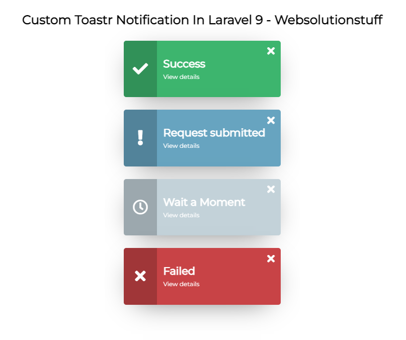
<div class="alerts">
  <div class="alert sucess">
    <span class="alert-icon"><i class="fas fa-check"></i>
    </span>
    <span class="alert-content">
      <span class="alert-close"><i class="fas fa-times"></i></span>
      <span class="alert-title">Success</span>
      <span class="alert-subtitle">View details</span>
    </span>
  </div>
  <div class="alert request">
    <span class="alert-icon"><i class="fas fa-exclamation"></i></span>
    <span class="alert-content">
      <span class="alert-close"><i class="fas fa-times"></i></span>
      <span class="alert-title">Request submitted</span>
      <span class="alert-subtitle">
        View details
        <ul class="little-list">
          <li>New account has been created</li>
          <li>New provider has been created</li>
          <li>New provider has been created</li>
          <li>New provider has been created</li>
        </ul>
      </span>
    </span>
  </div>
  <div class="alert wait">
    <span class="alert-icon"><i class="far fa-clock"></i></span>
    <span class="alert-content">
      <span class="alert-close"><i class="fas fa-times"></i></span>
      <span class="alert-title">Wait a Moment</span>
      <span class="alert-subtitle">
        View details
        <ul class="little-list">
          <li>New account has been created</li>
          <li>New provider has been created</li>
        </ul>
      </span>
    </span>
  </div>
  <div class="alert failed">
    <span class="alert-icon"><i class="fas fa-times"></i></span>
    <span class="alert-content">
      <span class="alert-close"><i class="fas fa-times"></i></span>
      <span class="alert-title">Failed</span>
      <span class="alert-subtitle">
        View details
        <ul class="little-list">
          <li>New account has been created</li>
          <li>New provider has been created</li>
        </ul>
      </span>
    </span>
  </div>
</div>
Add google font in the <head> tag.
<link href="https://fonts.googleapis.com/css?family=Montserrat&display=swap" rel="stylesheet"> In this step, we will add CSS for custom alert message notifications.
.alerts {
	 top: 0;
	 bottom: 0;
	 position: fixed;
	 display: flex;
	 flex-flow: column;
	 font-family: 'Montserrat', sans-serif;
	 padding: 30px;
	 width: auto;
}
 .alerts .alert {
	 display: flex;
	 flex-flow: row;
	 margin: 10px 0;
	 width: 250px;
	 min-height: 90px;
	 height: auto;
	 background-color: #cecece;
	 border-radius: 4px;
	 color: #fff;
	 box-shadow: 0px 10px 46px -21px rgba(0, 0, 0, 0.75);
	 transition: all 0.3s cubic-bezier(0, 0, 0.3, 1);
	 cursor: pointer;
}
 .alerts .alert:hover {
	 box-shadow: 0px 10px 60px -21px rgba(0, 0, 0, 0.80);
}
 .alerts .alert.sucess {
	 background-color: #3db56e;
}
 .alerts .alert.request {
	 background-color: #67a4c0;
}
 .alerts .alert.wait {
	 background-color: #c3d2d9;
}
 .alerts .alert.failed {
	 background-color: #c84346;
}
 .alerts .alert-icon {
	 font-weight: 300;
	 display: flex;
	 align-items: center;
	 justify-content: center;
	 width: 30%;
	 border-top-left-radius: 4px;
	 border-bottom-left-radius: 4px;
	 background-color: rgba(0, 0, 0, 0.2);
}
 .alerts .alert-content {
	 position: relative;
	 padding: 10px;
	 display: flex;
	 justify-content: center;
	 align-items: flex-start;
	 flex-flow: column;
	 width: 100%;
}
 .alerts .alert-content .alert-close {
	 position: absolute;
	 font-size: 0.7em;
	 top: 7px;
	 right: 10px;
	 cursor: pointer;
}
 .alerts .alert-content .alert-title {
	 padding-right: 12px;
	 font-size: 0.7em;
	 font-weight: 700;
}
 .alerts .alert-content .alert-subtitle {
	 display: flex;
	 flex-flow: column;
	 margin-top: 5px;
	 font-size: 0.4em;
	 font-weight: 300;
}
 .alerts .alert-content .alert-subtitle .little-list {
	 display: none;
	 padding: 0 10px;
}
/* demo */
 * {
	 padding: 0;
	 margin: 0;
}
 body, html {
	 height: 100%;
}
 body {
	 font-family: Montserrat, sans-serif;
	 display: flex;
	 flex-direction: column;
	 justify-content: center;
	 align-items: center;
	 min-height: 100vh;
	 font-size: 1.5rem;
	 background-color: #bdbdbd;
}
Add font awesome CSS.
<link href="https://cdnjs.cloudflare.com/ajax/libs/font-awesome/5.11.2/css/all.min.css" rel="stylesheet"> Now, we will add jquery to close the notification and also add jquery.min.js.
<script src="https://cdnjs.cloudflare.com/ajax/libs/jquery/3.4.1/jquery.min.js">$(document).ready(function () {
$( ".alert" ).click(function() {
$( this ).find( ".little-list" ).slideToggle();
});
$( ".alert-close" ).click(function() {
$( this ).parent().parent().fadeOut();
});
});Output:
You might also like:
- Read Also: Laravel Firebase Push Notification
- Read Also: How To Create Dynamic Linechart In Laravel
- Read Also: Laravel 8 Socialite Login with Google Account
- Read Also: How to Deploy Laravel on Heroku with Database