Tìm kiếm cho:
I have a <div> element which contains text and I want to align the contents of this <div> vertically center.
Here is my <div> style:
#box {
  height: 170px;
  width: 270px;
  background: #000;
  font-size: 48px;
  color: #FFF;
  text-align: center;
}
<div id="box">
Lorem ipsum dolor sit
</div>What is the best way to achieve this goal?
You can try this basic approach:
div {
  height: 100px;
  line-height: 100px;
  text-align: center;
  border: 2px dashed #f69c55;
}
<div>
Hello World!
</div>It only works for a single line of text though, because we set the line's height to the same height as the containing box element.
This is another way to align text vertically. This solution will work for a single line and multiple lines of text, but it still requires a fixed height container:
div {
  height: 100px;
  line-height: 100px;
  text-align: center;
  border: 2px dashed #f69c55;
}
span {
  display: inline-block;
  vertical-align: middle;
  line-height: normal;
}
<div>
<span>Hello World!</span>
</div>The CSS just sizes the <div>, vertically center aligns the <span> by setting the <div>'s line-height equal to its height, and makes the <span> an inline-block with vertical-align: middle. Then it sets the line-height back to normal for the <span>, so its contents will flow naturally inside the block.
And here is another option, which may not work on older browsers that don't support display: table and display: table-cell (basically just Internet Explorer 7). Using CSS we simulate table behavior (since tables support vertical alignment), and the HTML is the same as the second example:
div {
  display: table;
  height: 100px;
  width: 100%;
  text-align: center;
  border: 2px dashed #f69c55;
}
span {
  display: table-cell;
  vertical-align: middle;
}
<div>
<span>Hello World!</span>
</div>This technique uses an absolutely positioned element setting top, bottom, left and right to 0. It is described in more detail in an article in Smashing Magazine, Absolute Horizontal And Vertical Centering In CSS.
div {
  display: flex;
  justify-content: center;
  align-items: center;
  height: 100px;
  width: 100%;
  border: 2px dashed #f69c55;
}
<div>
<span>Hello World!</span>
</div>Answered 2023-09-20 20:25:18
height was in a % value, so I used em and that worked. - anyone Another way (not mentioned here yet) is with Flexbox.
Just add the following code to the container element:
display: flex;
justify-content: center; /* Align horizontal */
align-items: center; /* Align vertical */
.box {
  height: 150px;
  width: 400px;
  background: #000;
  font-size: 24px;
  font-style: oblique;
  color: #FFF;
  text-align: center;
  padding: 0 20px;
  margin: 20px;
  display: flex;
  justify-content: center;
  /* align horizontal */
  align-items: center;
  /* align vertical */
}
<div class="box">
Lorem ipsum dolor sit amet, consectetuer adipiscing elit, sed diam nonummy nibh
</div>Alternatively, instead of aligning the content via the container, flexbox can also center a flex item with an auto margin when there is only one flex-item in the flex container (like the example given in the question above).
So to center the flex item both horizontally and vertically just set it with margin:auto
.box {
  height: 150px;
  width: 400px;
  background: #000;
  font-size: 24px;
  font-style: oblique;
  color: #FFF;
  text-align: center;
  padding: 0 20px;
  margin: 20px;
  display: flex;
}
.box span {
  margin: auto;
}
<div class="box">
<span>margin:auto on a flex item centers it both horizontally and vertically</span>
</div>NB: All the above applies to centering items while laying them out in horizontal rows. This is also the default behavior, because by default the value for flex-direction is row. If, however flex-items need to be laid out in vertical columns, then flex-direction: column should be set on the container to set the main-axis as column and additionally the justify-content and align-items properties now work the other way around with justify-content: center centering vertically and align-items: center centering horizontally)
flex-direction: column demo.box {
height: 150px;
width: 400px;
background: #000;
font-size: 18px;
font-style: oblique;
color: #FFF;
display: flex;
flex-direction: column;
justify-content: center;
/* vertically aligns items */
align-items: center;
/* horizontally aligns items */
}
p {
margin: 5px;
}<div class="box">
<p>
When flex-direction is column...
</p>
<p>
"justify-content: center" - vertically aligns
</p>
<p>
"align-items: center" - horizontally aligns
</p>
</div>A good place to start with Flexbox to see some of its features and get syntax for maximum browser support is flexyboxes
Also, browser support nowadays is very good: caniuse
For cross-browser compatibility for display: flex and align-items, you can use the following:
display: -webkit-box;
display: -webkit-flex;
display: -moz-box;
display: -ms-flexbox;
display: flex;
-webkit-flex-align: center;
-ms-flex-align: center;
-webkit-align-items: center;
align-items: center;
Answered 2023-09-20 20:25:18
height: 100%; - anyone You can easily do this by adding the following piece of CSS code:
display: table-cell;
vertical-align: middle;
That means your CSS finally looks like:
#box {
  height: 90px;
  width: 270px;
  background: #000;
  font-size: 48px;
  font-style: oblique;
  color: #FFF;
  text-align: center;
  margin-top: 20px;
  margin-left: 5px;
  display: table-cell;
  vertical-align: middle;
}
<div id="box">
Some text
</div>Answered 2023-09-20 20:25:18
display: flex; justify-content: center; align-items: center;. Thanks - anyone For reference and to add a simpler answer:
Pure CSS:
.vertical-align {
    position: relative;
    top: 50%;
    -webkit-transform: translateY(-50%);
    -ms-transform: translateY(-50%);
    transform: translateY(-50%);
}
Or as a SASS/SCSS Mixin:
@mixin vertical-align {
    position: relative;
    top: 50%;
    -webkit-transform: translateY(-50%);
    -ms-transform: translateY(-50%);
    transform: translateY(-50%);
}
Use by:
.class-to-center {
    @include vertical-align;
}
By Sebastian Ekström's blog post Vertical align anything with just 3 lines of CSS:
This method can cause elements to be blurry due to the element being placed on a “half pixel”. A solution for this is to set its parent element to preserve-3d. Like following:
.parent-element {
    -webkit-transform-style: preserve-3d;
    -moz-transform-style: preserve-3d;
    transform-style: preserve-3d;
}
We live in 2015+ and Flex Box is supported by every major modern browser.
It will be the way websites are made from here on out.
Learn it!
Answered 2023-09-20 20:25:18
All credit goes to this link owner @Sebastian Ekström Link; please go through this. See it in action codepen. By reading the above article I also created a demo fiddle.
With just three lines of CSS (excluding vendor prefixes) we can do it with the help of a transform: translateY vertically centers whatever we want, even if we don’t know its height.
The CSS property transform is usually used for rotating and scaling elements, but with its translateY function we can now vertically align elements. Usually this must be done with absolute positioning or setting line-heights, but these require you to either know the height of the element or only works on single-line text, etc.
So, to do this we write:
.element {
    position: relative;
    top: 50%;
    transform: translateY(-50%);
}
That’s all you need. It is a similar technique to the absolute-position method, but with the upside that we don’t have to set any height on the element or position-property on the parent. It works straight out of the box, even in Internet Explorer 9!
To make it even more simple, we can write it as a mixin with its vendor prefixes.
Answered 2023-09-20 20:25:18
There is a tiny magic with CSS3 flexboxes:
/* Important */
section {
    display: flex;
    display: -webkit-flex;
}
section p {
    /* Key Part */
    margin: auto;
}


/* Unimportant, coloring and UI */
section {
    height: 200px;
    width: 60%;
    margin: auto;
    border-radius: 20px;
    border: 3px solid orange;
    background-color: gold;
}
section p {
    text-align: center;
    font-family: Cantarell, Calibri;
    font-size: 15px;
    background-color: yellow;
    border-radius: 20px;
    padding: 15px;
}
<section>
<p>
I'm a centered box!<br/>
Flexboxes are great!
</p>
</section>Tip: Replace the line above marked as "Key Part" with one of these lines, if you want to center the text:
Only vertically:
margin: auto 0;
Only horizontally:
margin: 0 auto;
As I noticed, this trick works with grids (i.e. display: grid), also.
Answered 2023-09-20 20:25:18
Here is another option using Flexbox.
#container {
  display: flex;
  height: 200px;
  background: orange;
}

.child {
  margin: auto;
}
<div id="container">
<div class="child">
<span>Lorem ipsum dolor sit amet consectetur adipisicing elit. Molestiae, nemo.</span>
</div>
</div>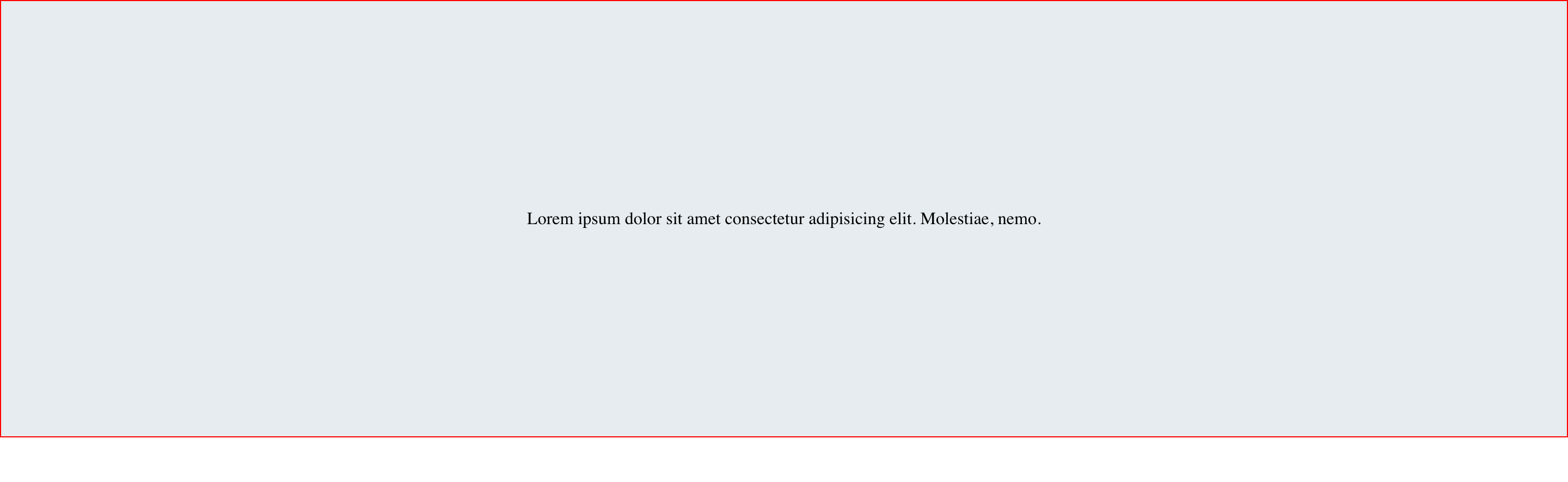
Here is a great article about centering in CSS. Check it out.
Answered 2023-09-20 20:25:18
Flexible approach
div {
  width: 250px;
  min-height: 50px;
  line-height: 50px;
  text-align: center;
  border: 1px solid #123456;
  margin-bottom: 5px;
}
span {
  display: inline-block;
  vertical-align: middle;
  line-height: normal;
}
<div>
<span>Lorem ipsum dolor sit amet, consectetur adipiscing elit.<br />
Lorem ipsum dolor sit amet, consectetur adipiscing elit.<br />
Lorem ipsum dolor sit amet, consectetur adipiscing elit.</span>
</div>
<div>
<span>Lorem ipsum dolor sit amet, consectetur adipiscing elit.</span>
</div>
<div>
<span>Lorem ipsum dolor sit amet.</span>
</div>
<div>Answered 2023-09-20 20:25:18
I saw the previous answers, and they will work only for that width of screen (not responsive). For the responsive you have to use flex.
Example:
div { display:flex; align-items:center; }
Answered 2023-09-20 20:25:18
The solution accepted as the answer is perfect to use line-height the same as the height of div, but this solution does not work perfectly when text is wrapped OR is in two lines.
Try this one if text is wrapped or is on multiple lines inside a div.
#box
{
  display: table-cell;
  vertical-align: middle;
}
For more reference, see:
Answered 2023-09-20 20:25:18
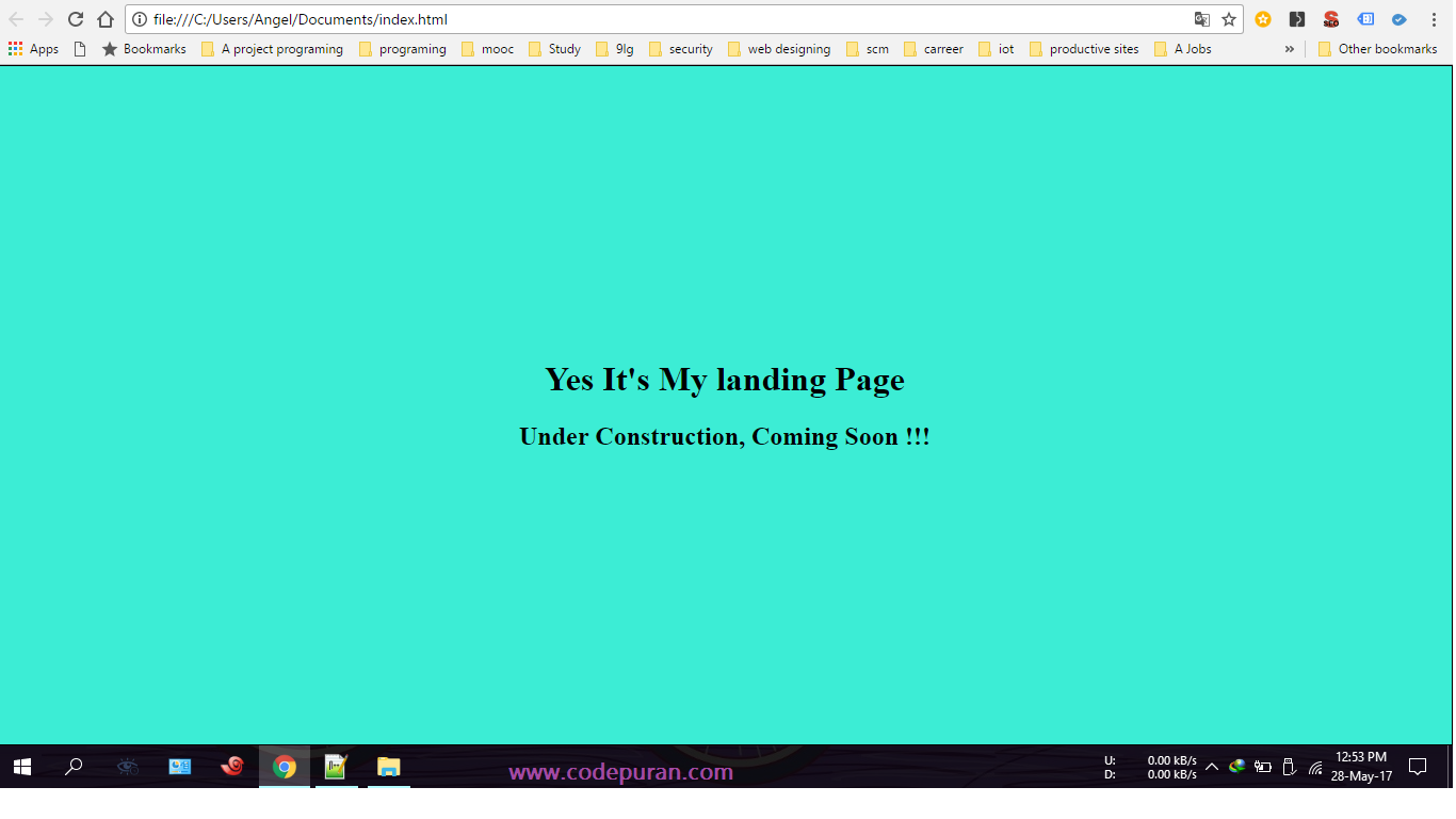
You can use the following code snippet as the reference. It is working like a charm for me:
html,
body {
  height: 100%;
  margin: 0;
  padding: 0;
  width: 100%;
}

body {
  display: table;
}

.centered-text {
  text-align: center;
  display: table-cell;
  vertical-align: middle;
}
<div class="centered-text">
<h1>Yes, it's my landing page</h1>
<h2>Under construction, coming soon!!!</h2>
</div>The output of the above code snippet is as follow:
Answered 2023-09-20 20:25:18
Try this solution:
.EXTENDER {
    position: absolute;
    top: 0px;
    left: 0px;
    bottom: 0px;
    right: 0px;
    width: 100%;
    height: 100%;
    overflow-y: hidden;
    overflow-x: hidden;
}

.PADDER-CENTER {
    width: 100%;
    height: 100%;
    display: -webkit-box;
    display: -moz-box;
    display: -ms-flexbox;
    display: -webkit-flex;
    display: flex;
    -webkit-box-pack: center;
    -moz-box-pack: center;
    -ms-flex-pack: center;
    -webkit-justify-content: center;
    justify-content: center;
    -webkit-box-align: center;
    -moz-box-align: center;
    -ms-flex-align: center;
    -webkit-align-items: center;
    align-items: center;
}
<div class="EXTENDER">
<div class="PADDER-CENTER">
<div contentEditable="true">Edit this text...</div>
</div>
</div>Built using CSS+.
Answered 2023-09-20 20:25:18
You can also use below properties.
display: flex;
align-content: center;
justify-content : center;
Answered 2023-09-20 20:25:18
Another way:
Don't set the height attribute of the div, but instead use padding: to achieve the effect. Similarly to line-height, it only works if you have one line of text. Although this way, if you have more content, the text will still be centered, but the div itself will be slightly larger.
So instead of going with:
div {
  height: 120px;
  line-height: 120px;
}
You can say:
div {
   padding: 60px 0; /* Maybe 60 minus font-size divided by two, if you want to be exact */
}
This will set the top and bottom padding of the div to 60px, and the left and right padding to zero, making the div 120 pixels (plus the height of your font) high, and placing the text vertically centered in the div.
Answered 2023-09-20 20:25:18
I'm not sure anyone has gone the writing-mode route, but I think it solves the problem cleanly and has broad support:
.vertical {
  //border: 1px solid green;
  writing-mode: vertical-lr;
  text-align: center;
  height: 100%;
  width: 100%;
}
.horizontal {
  //border: 1px solid blue;
  display: inline-block;
  writing-mode: horizontal-tb;
  width: 100%;
  text-align: center;
}
.content {
  text-align: left;
  display: inline-block;
  border: 1px solid #e0e0e0;
  padding: .5em 1em;
  border-radius: 1em;
}
<div class="vertical">
<div class="horizontal">
<div class="content">
I'm centered in the vertical and horizontal thing
</div>
</div>
</div>This will, of course, work with any dimensions you need (besides 100% of the parent). If you uncomment the border lines, it'll be helpful to familiarize yourself.
JSFiddle demo for you to fiddle.
Caniuse support: 85.22% + 6.26% = 91.48% (even Internet Explorer is in!)
Answered 2023-09-20 20:25:18
For all your vertical alignment needs!
Declare this Mixin:
@mixin vertical-align($position: relative) {
  position: $position;
  top: 50%;
  -webkit-transform: translateY(-50%);
  -ms-transform: translateY(-50%);
  transform: translateY(-50%);
}
Then include it in your element:
.element{
    @include vertical-align();
}
Answered 2023-09-20 20:25:18
Even better idea for this. You can do like this too
body,
html {
  height: 100%;
}

.parent {
  white-space: nowrap;
  height: 100%;
  text-align: center;
}

.parent:after {
  display: inline-block;
  vertical-align: middle;
  height: 100%;
  content: '';
}

.centered {
  display: inline-block;
  vertical-align: middle;
  white-space: normal;
}
<div class="parent">
<div class="centered">
<p>Lorem ipsum dolor sit amet.</p>
</div>
</div>Answered 2023-09-20 20:25:18
For a single line of text (or a single character) you can use this technique:
It can be used when #box has a non-fixed, relative height in %.
<div id="box"></div>
#box::before {
    display: block;
    content: "";
    height: 50%;
}

#box::after {
    vertical-align: top;
    line-height: 0;
    content: "TextContent";
}
See a live demo at JsBin (easier to edit CSS) or JsFiddle (easier to change height of result frame).
If you want to place inner text in HTML, not in CSS, then you need to wrap text content in additional inline element and edit #box::after to match it. (And, of course, content: property should be removed.)
For example,
<div id="box"><span>TextContent</span></div>.
In this case, #box::after should be replaced with #box span.
For Internet Explorer 8 support you must replace :: with :.
Answered 2023-09-20 20:25:18
The simple and versatile way is (as Michielvoo's table approach):
[ctrv]{
    display: table !important;
}

[ctrv] > *{ /* Addressing direct descendants */
      display: table-cell;
      vertical-align: middle;
      // text-align: center; /* Optional */
}
Using this attribute (or a equivalent class) on a parent tag works even for many children to align:
<parent ctrv> <ch1/> <ch2/> </parent>
Answered 2023-09-20 20:25:18
Try the transform property:
 #box {
  height: 90px;
  width: 270px;
  position: absolute;
  top: 50%;
  left: 50%;
  transform: translate(-50%, -50%);
}
<div Id="box">
Lorem ipsum dolor sit amet, consectetur adipiscing elit.
</div>Answered 2023-09-20 20:25:18
A very simple & most powerful solution to vertically align center:
.outer-div {
  height: 200px;
  width: 200px;
  text-align: center;
  border: 1px solid #000;
}

.inner {
  position: relative;
  top: 50%;
  transform: translateY(-50%);
  color: red;
}
<div class="outer-div">
<span class="inner">No data available</span>
</div>Answered 2023-09-20 20:25:18
The following code will put the div in the middle of the screen regardless of screen size or div size:
.center-screen {
  display: flex;
  flex-direction: column;
  justify-content: center;
  align-items: center;
  text-align: center;
  min-height: 100vh;
}
<html>
<head>
</head>
<body>
<div class="center-screen">
I'm in the center
</div>
</body>
</html>See more details about flex here.
Answered 2023-09-20 20:25:18
Try the following code:
display: table-cell;
vertical-align: middle;
div {
  height: 80%;
  width: 100%;
  text-align: center;
  display: table-cell;
  vertical-align: middle;
  background: #4CAF50;
  color: #fff;
  font-size: 50px;
  font-style: italic;
}
<div>
Lorem Ipsum is simply dummy text of the printing and typesetting industry. Lorem Ipsum has been the industry's standard dummy text ever since the 1500s
</div>Answered 2023-09-20 20:25:18
I would just like to extend the answer from Michielvoo in order to release need for line-height and breathing of div height. It is basically just a simplified version like this:
div {
  width: 250px;
  /* height: 100px;
  line-height: 100px; */
  text-align: center;
  border: 1px solid #123456;
  background-color: #bbbbff;
  padding: 10px;
  margin: 10px;
}

span {
  display: inline-block;
  vertical-align: middle;
  line-height: normal;
}
<div>
<span>All grown-ups were once children... but only few of them remember it</span>
</div>
<div>
<span>And now here is my secret, a very simple secret: It is only with the heart that one can see rightly; what is essential is invisible to the eye.</span>
</div>NOTE: commented out part of cssis needed for fixed-height of enclosing div.
Answered 2023-09-20 20:25:18
I needed a row of clickable elephants, vertically centered, but without using a table to get around some Internet Explorer 9 weirdness.
I eventually found the nicest CSS (for my needs) and it's great with Firefox, Chrome, and Internet Explorer 11. Sadly Internet Explorer 9 is still laughing at me...
div {
  border: 1px dotted blue;
  display: inline;
  line-height: 100px;
  height: 100px;
}

span {
  border: 1px solid red;
  display: inline-block;
  line-height: normal;
  vertical-align: middle;
}

.out {
  border: 3px solid silver;
  display: inline-block;
}
<div class="out" onclick="alert(1)">
<div> <span><img src="http://www.birdfolk.co.uk/littleredsolo.png"/></span> </div>
<div> <span>A lovely clickable option.</span> </div>
</div>
<div class="out" onclick="alert(2)">
<div> <span><img src="http://www.birdfolk.co.uk/bang2/Ship01.png"/></span> </div>
<div> <span>Something charming to click on.</span> </div>
</div>Obviously you don't need the borders, but they can help you see how it works.
Answered 2023-09-20 20:25:18
You can use the positioning method in CSS:
HTML:
<div class="relativediv">
  <p>
    Make me vertical align as center
  </p>
</div>
CSS:
.relativediv {
    position: relative;
    border: 1px solid #DDD;
    height: 300px;
    width: 300px
}
.relativediv p {
    position: absolute;
    top: 50%;
    transfrom: translateY(-50%);
}
Answered 2023-09-20 20:25:18
Wherever you want vertically center style means you can try display:table-cell and vertical-align:middle.
Example:
#box
{
  display: table-cell;
  vertical-align: middle;
  height: 90px;
  width: 270px;
  background: #000;
  font-size: 48px;
  font-style: oblique;
  color: #FFF;
  text-align: center;
  margin-top: 20px;
  margin-left: 5px;
}
<div Id="box">
Lorem ipsum dolor sit amet, consectetur adipiscing elit.
</div>Answered 2023-09-20 20:25:18
Set it within button instead of div if you don't care about its little visual 3D effect.
#box
{
  height: 120px;
  width: 300px;
  background: #000;
  font-size: 48px;
  font-style: oblique;
  color: #FFF;
}
<button Id="box" disabled>
Lorem ipsum dolor sit amet, consectetur adipiscing elit.
</button>Answered 2023-09-20 20:25:18
Absolute Positioning and Stretching
As with the method above this one begins by setting positioning on the parent and child elements as relative and absolute respectively. From there things differ.
In the code below I’ve once again used this method to center the child both horizontally and vertically, though you can use the method for vertical centering only.
HTML
<div id="parent">
    <div id="child">Content here</div>
</div>
CSS
#parent {position: relative;}
#child {
    position: absolute;
    top: 0;
    bottom: 0;
    left: 0;
    right: 0;
    width: 50%;
    height: 30%;
    margin: auto;
}
The idea with this method is to try to get the child element to stretch to all four edges by setting the top, bottom, right, and left vales to 0. Because our child element is smaller than our parent elements it can’t reach all four edges.
Setting auto as the margin on all four sides however causes opposite margins to be equal and displays our child div in the center of the parent div.
Unfortunately the above won’t work in Internet Explorer 7 and below, and like the previous method the content inside the child div can grow too large, causing it to be hidden.
Answered 2023-09-20 20:25:18
.element{position: relative;top: 50%;transform: translateY(-50%);}
Add this small code in the CSS property of your element. It is awesome. Try it!
Answered 2023-09-20 20:25:18
DEVSNE.VN